03
RESPONSIBILITIES
DELIVERABLES
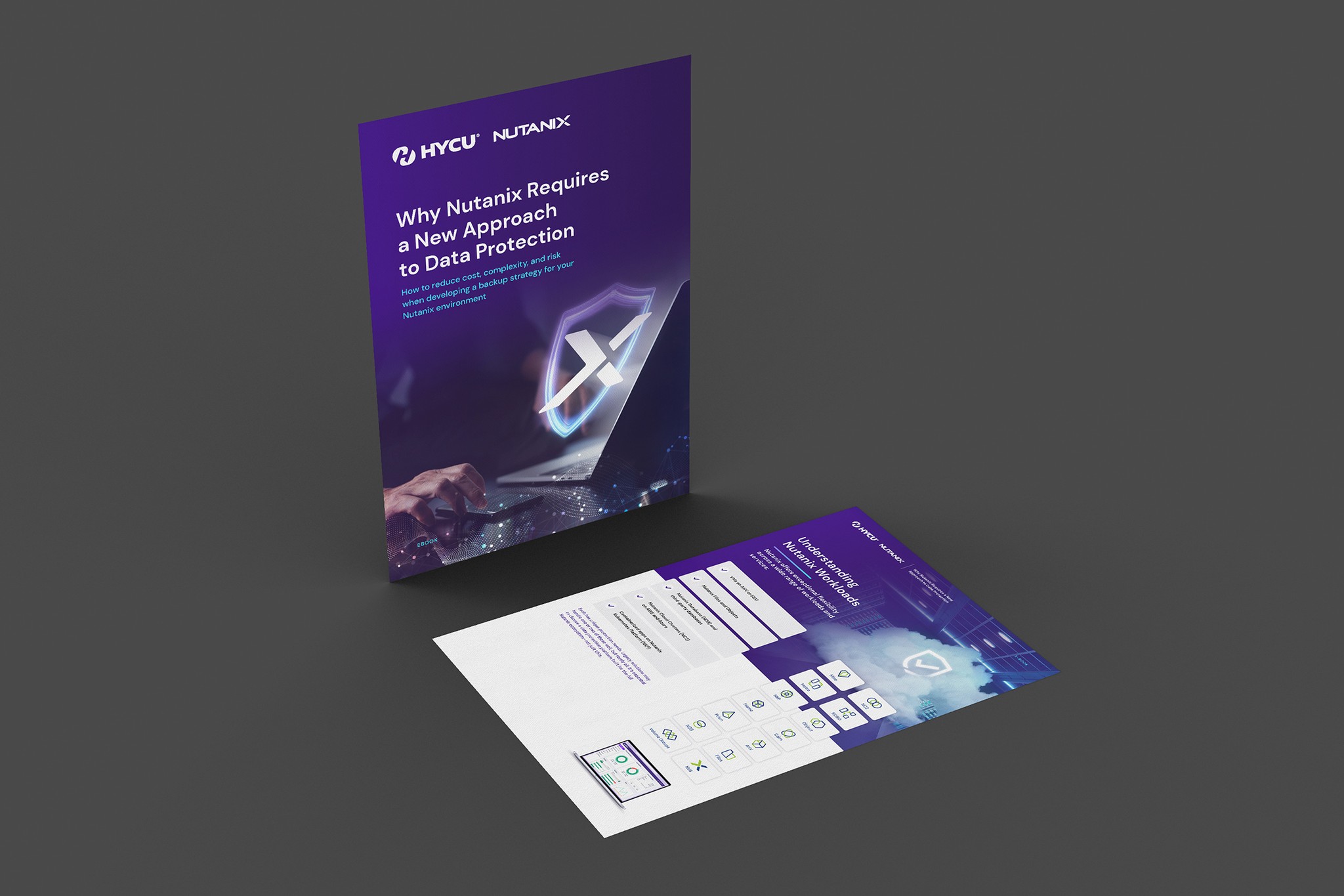
Brand Collateral, Design System Toolkit, Print & Digital Assets
THE CHALLENGE
When I joined HYCU, they were at a turning point - ready to rethink how they presented themselves to the world. The product was strong, the team was growing, but the brand didn’t reflect the simplicity or vision driving it all. I joined as their in-house designer right as the rebrand kicked off, giving me a front-row seat - and a hands-on role - in helping steer that change.
It was more than just a job. This one mattered. I worked closely with the folks at Studio Mococo (the team behind the Twitter logo) and Ballyhoo to refine a brand that balanced tech credibility with human clarity - and a bit of wit, too. Every decision felt intentional, every meeting collaborative. It was the kind of project you look back on and smile.
OBJECTIVES


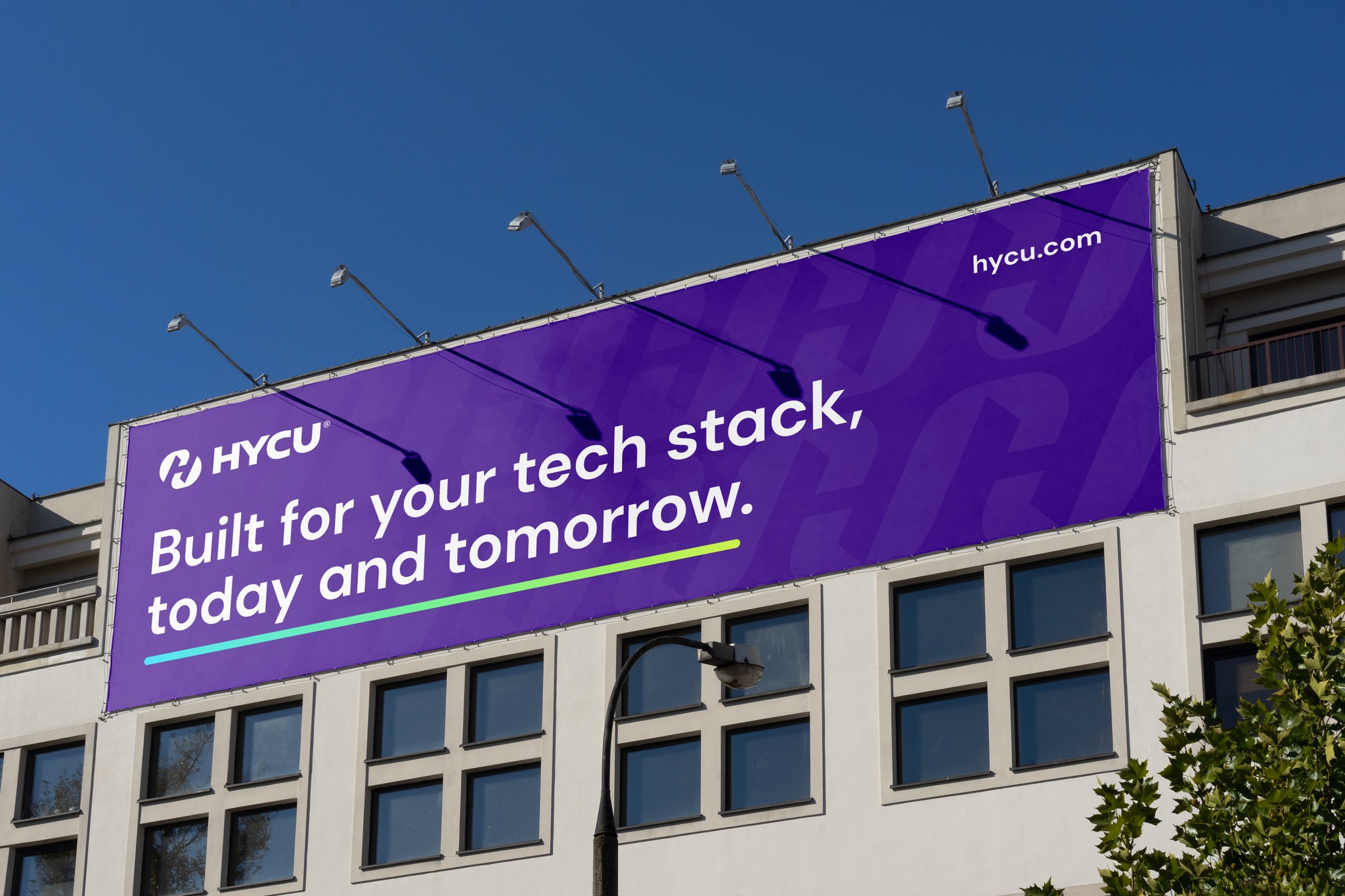
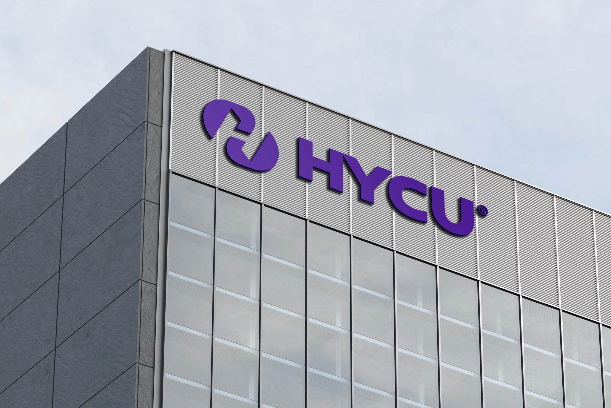
HYCU needed a system that could scale fast and look good doing it - from a web refresh to event banners to internal docs. My role was to bring structure, clarity, and that much-needed designer’s eye across all touchpoints.

HOW IT WORKED
I became the glue between external brand partners and the internal team - translating big-picture strategy into design deliverables that felt right. We worked through refinements on logo lockups, typography systems, and layouts, making sure they all felt “HYCU.” From pitch decks to product visuals, I helped shape a unified look that matched the clarity of the product.

THE OUTCOME
The rebrand didn’t just change how HYCU looked - it changed how the team (and the customers) felt about the company. The design system brought a sense of polish and purpose that bled into culture, internal confidence, and messaging. It was a proud, team-wide effort - and a highlight of my design journey so far.