04
RESPONSIBILITIES
DELIVERABLES
Identity System, Lookbook & Print Collateral, Launch Campaign Assets
THE CHALLENGE
Camden Co. had the product: high-quality materials, timeless silhouettes, and real attention to detail. But visually, the brand was missing the mark with its ideal customer. The identity felt generic, blending into a sea of high-street labels, and didn’t reflect the aspirational mindset of their target audience.

They approached me to help reposition the brand. This wasn’t about changing who they were - it was about better communicating what they already stood for. The brief was simple: elevate the perception and speak more clearly to the right crowd.
OBJECTIVES


The goal was to bridge the gap between product and perception - making sure the identity matched the expectations of their ideal customer.

HOW IT WORKED
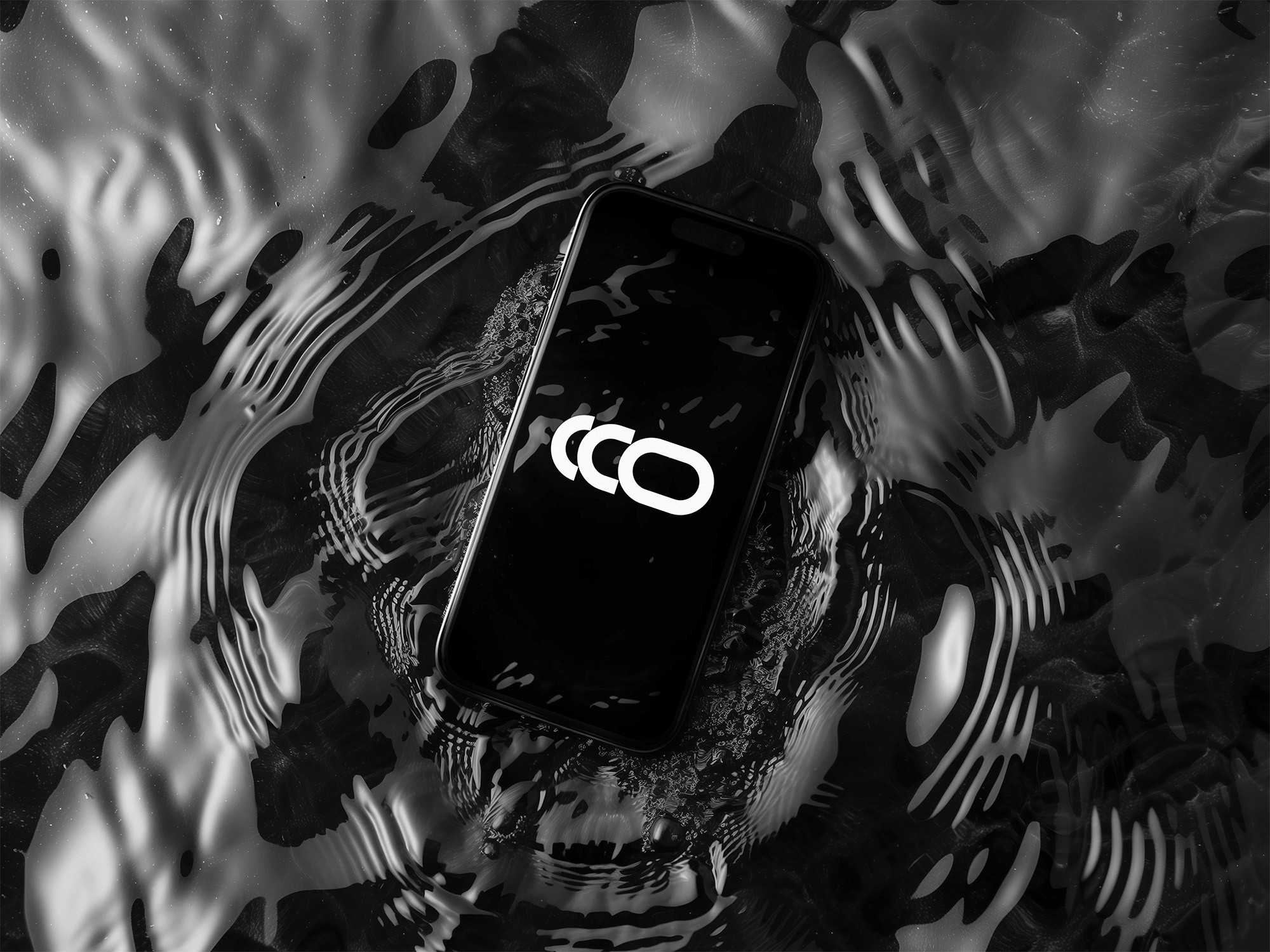
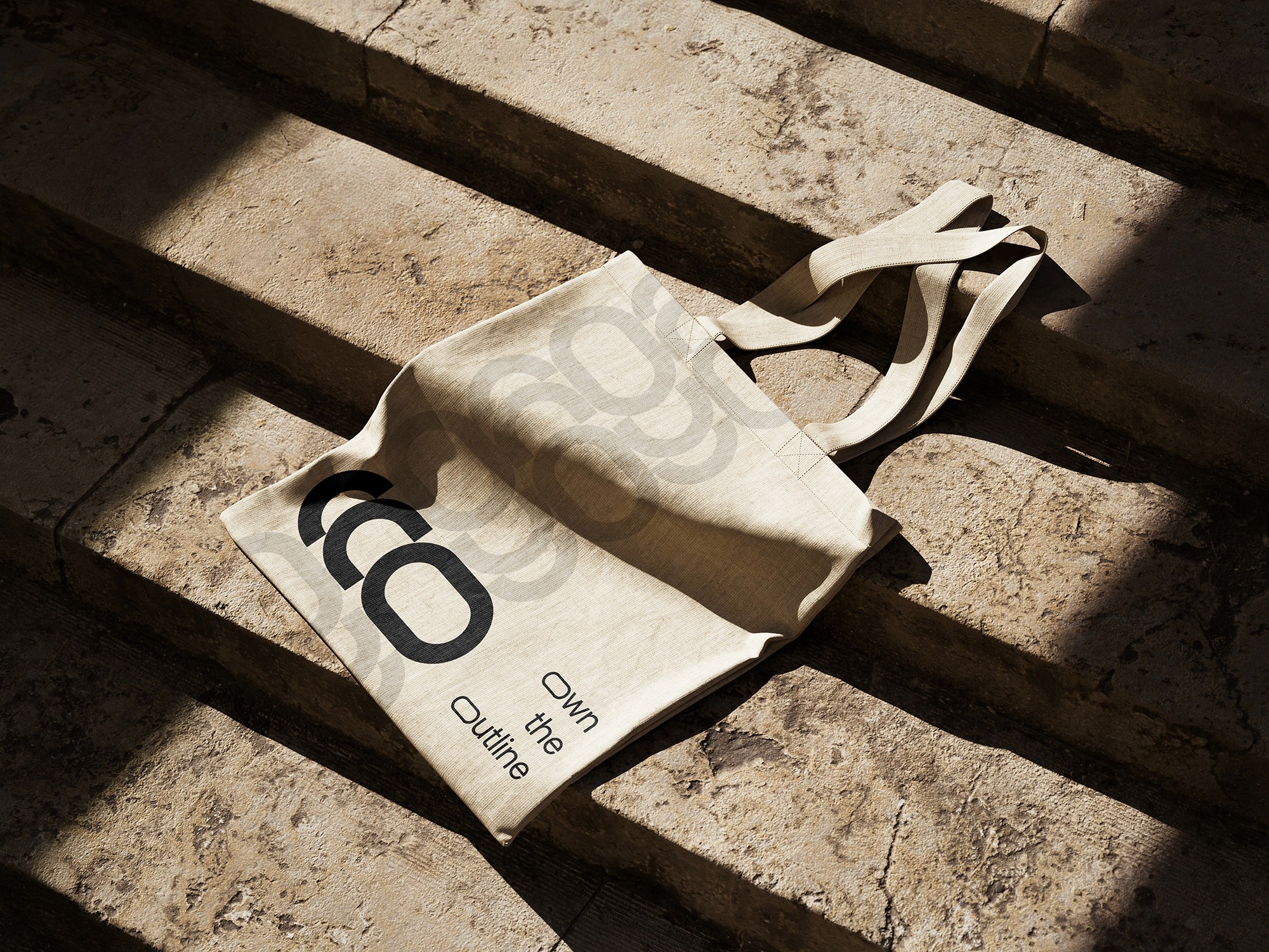
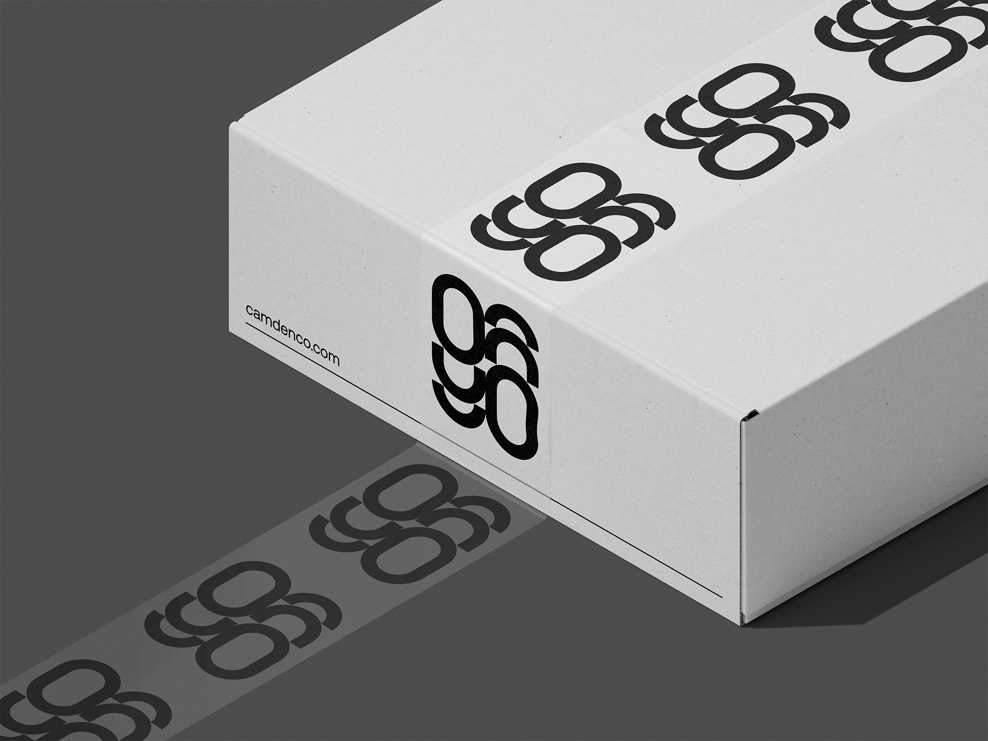
I focused on refining the visual language through typography, layout, and color. Editorial-style grids, serif and sans pairings, and moody photography helped create a sense of depth and intimacy. Every element - from product page spacing to packaging accents - was designed to reflect confidence without excess.
THE OUTCOME
The refreshed identity gave Camden Co. a stronger point of view and helped them connect with a more design-savvy audience. The visuals finally matched the quality of the garments and created a more intentional, aspirational presence across touchpoints.
