
THE CHALLENGE
Studio Forma didn’t care much about branding. They weren’t trying to trend on design blogs or win over award judges. They just wanted a system that felt like them - clear, grounded, and architectural. Their previous identity leaned too heavily into visual abstraction, creating more confusion than clarity.

They came to me looking for structure. Not a flashy rebrand, but something usable. A visual language that reflected how they worked and how they thought. Quiet confidence. Nothing more, nothing less.
OBJECTIVES

The goal was to build a brand that felt like a tool, not a concept - something they could rely on without overthinking.
HOW IT WORKED
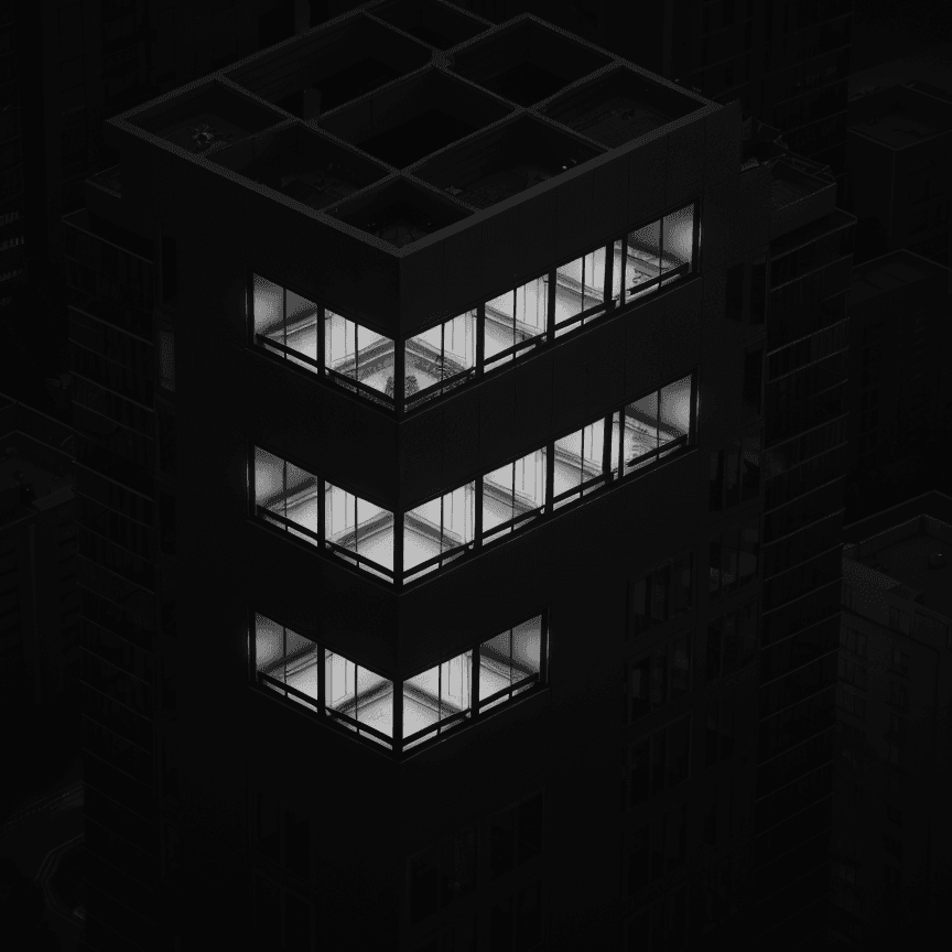
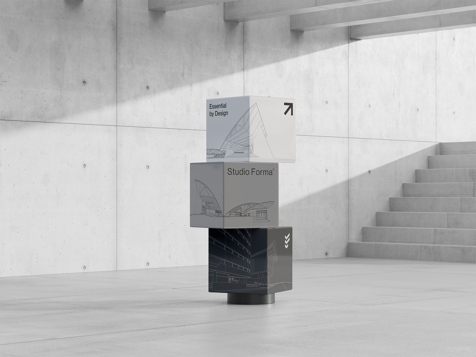
I focused on restraint. Drawing inspiration from Swiss-style typography and brutalist design principles, I leaned into structure, balance, and clarity. Strong typographic hierarchy, generous use of negative space, and a limited palette gave the brand room to breathe. I built a grid-based system they could use across formats, from pitch decks to signage, without compromising their tone. Every element was designed to stay out of the way and let the work speak.


OUTCOME
Forma now has a system that matches how they think: structured, sharp, and intentional. They can pitch faster, present better, and focus on the work without worrying about how it looks. No brand fluff. Just design that holds up.
